If you Googling for it it seems everybody (and his/her dog) has at least posted one top-10 listing of the worst Apple product ever (and ever-ever).
Same-Same
All those pages seem to “inspire” themselves from each other. So it’s essentially always the same suspects:
- Apple III
- Macintosh TV
- Quicktake Camera
- The Newton PDA
- The Pippin Games-console
- The Performa x200 family
- The 20th Aniversary Mac
- The first USB Mouse (aka Hockey Puck) as well as the Mighty Mouse
- The G4 Cube and
- the flimsy iPod Shuffle.
I’m ignoring those lists of people who learned about Apple as a company more or less with the launch of the iPhone. Pfffft, kids, come back in 20 years, will you? 😛
So before I tell you the truly worst Apple product ever (ever-ever-ever!) let me give you my two or three cents to that list…
Reality Check
First of all: All those products had a certain degree of design-language and an eye for details – I dare saying passion to them.
Even the Apple III was -at its time- a design statement (look at other computers of 1980: Commodore PET, TRS-80, ZX81 ot the KAYPROs). It was meant to be a better Apple II and yes, it had technical flaws, but if something made it “worse”, it was its price-tag.
I’d call the design of the 20th Anniversary Mac or the Hockey Puck bold – maybe too bold for its time. And both, as well as the G4 Cube and the Newton (110 and up) were designs by Jony Ive – the much hyped designer who also did the iPhone, iMac and nearly everything since, well, the iMac.
Some of them were more or less pioneers of their kind like the Newton being the first usable PDA and the Quicktake one of the first digital cameras (Put both put into one device, add 10 years: iPhone!)
So let’s recap:
They all might be commercial flops but they had a raison d’etre, followed a certain design concept and most important, you can feel a certain level of passion behind it. Maybe they were too expensive, released too early or just way ahead of its time – but in my humble opinion they were not the worst Apple products ever.
And do I have to add that mostly every product on that list is a highly sought-after collectors item now?
The truly worst Apple product ever
So finally, this is it. This Apple product is very unknown – probably rightly so. It ignores all the points I was recapping above:
- No reason d’etre
- No design philosophy or concept
- And absolutely no passion at all!
Its only intention was to save costs… yeah, that can be reason for being, but in this case “it’s worse”.
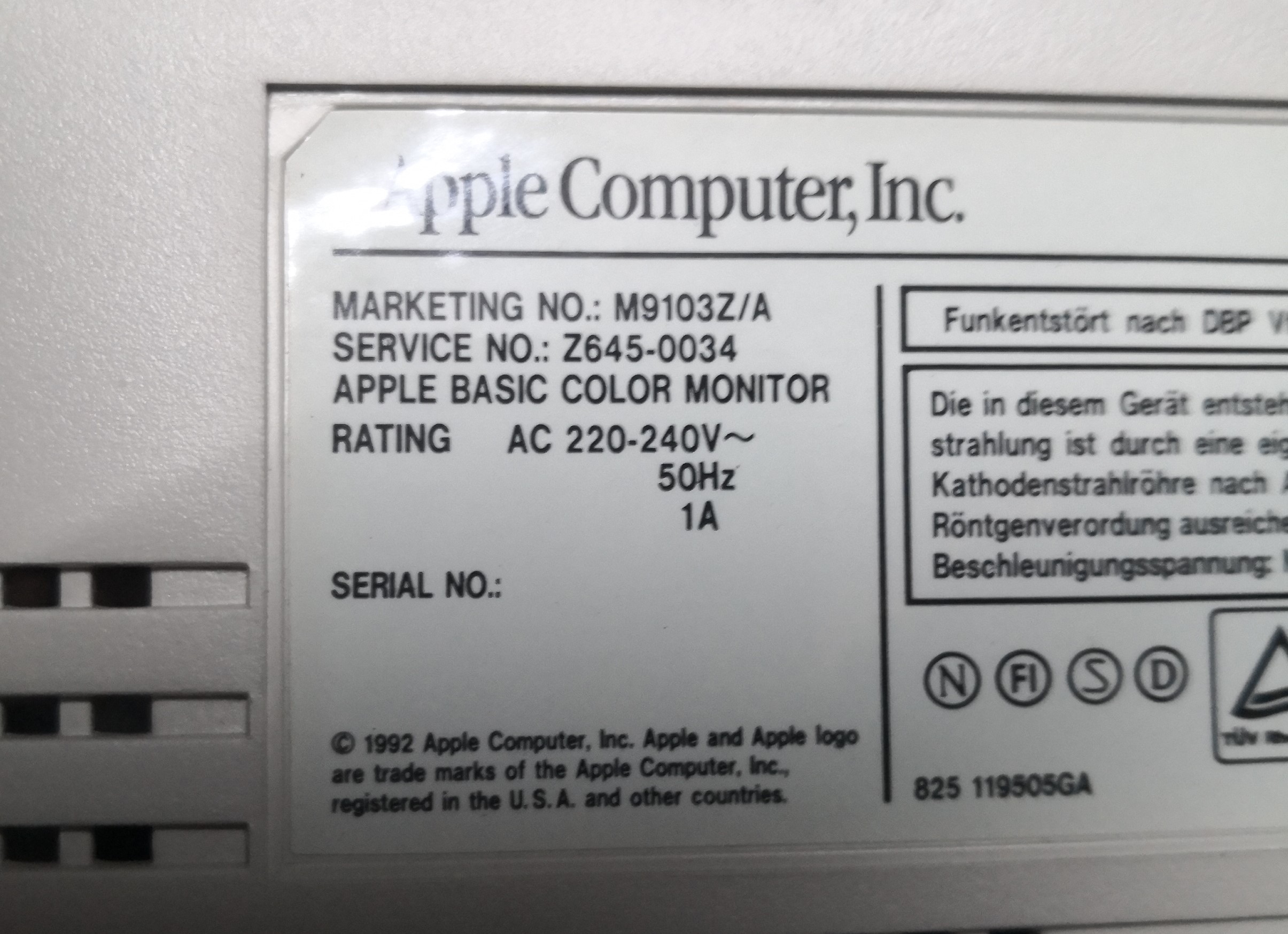
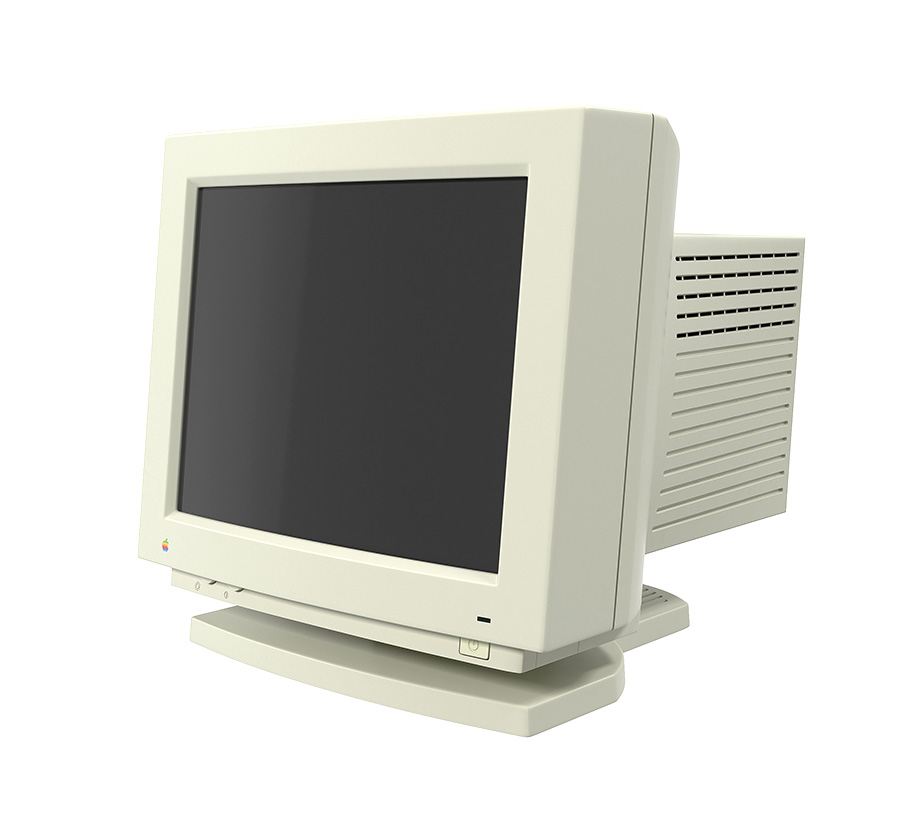
Please let me introduce you to “M9103” also known as the “Apple Basic Color Monitor“.
It’s a product from the beginning of an era in which Apple was close to bankruptcy. Struggling against the much cheaper x86 PC the Macintosh product family got confusing and they tried to somehow compete with PC prices spitting out one low-cost system after another.
The rightfully hated Performa x200 (the #1 “road apple”) and PowerMac 4400 were the pinnacle of all cost-reduced products Apple released… and the M9103 is where it all started.
To protect you from severe shock I slowly move backwards, beginning with the label on its back, proving it’s a genuine Apple product:
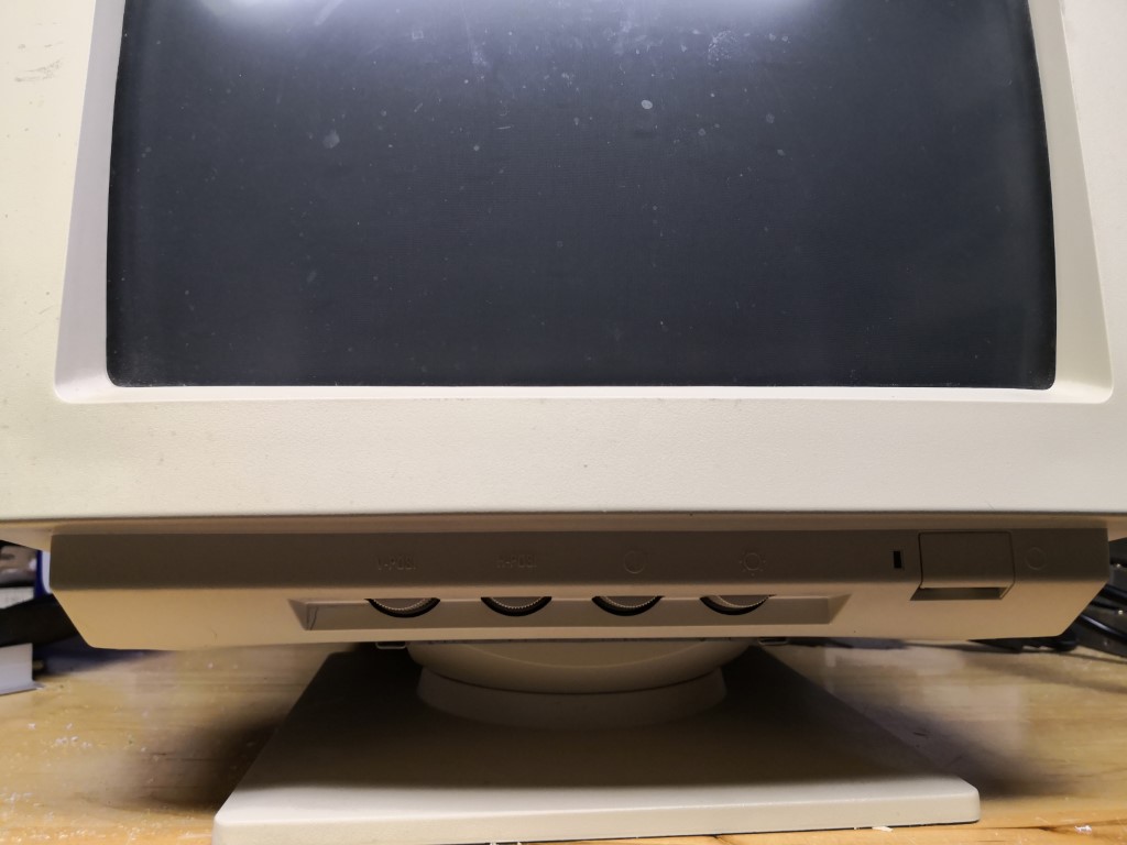
Let’s take some distance to see it’s backside in full – still, there could be hope if they would have kept the more or less rectangular shape… but bottom of the case is not looking promising.
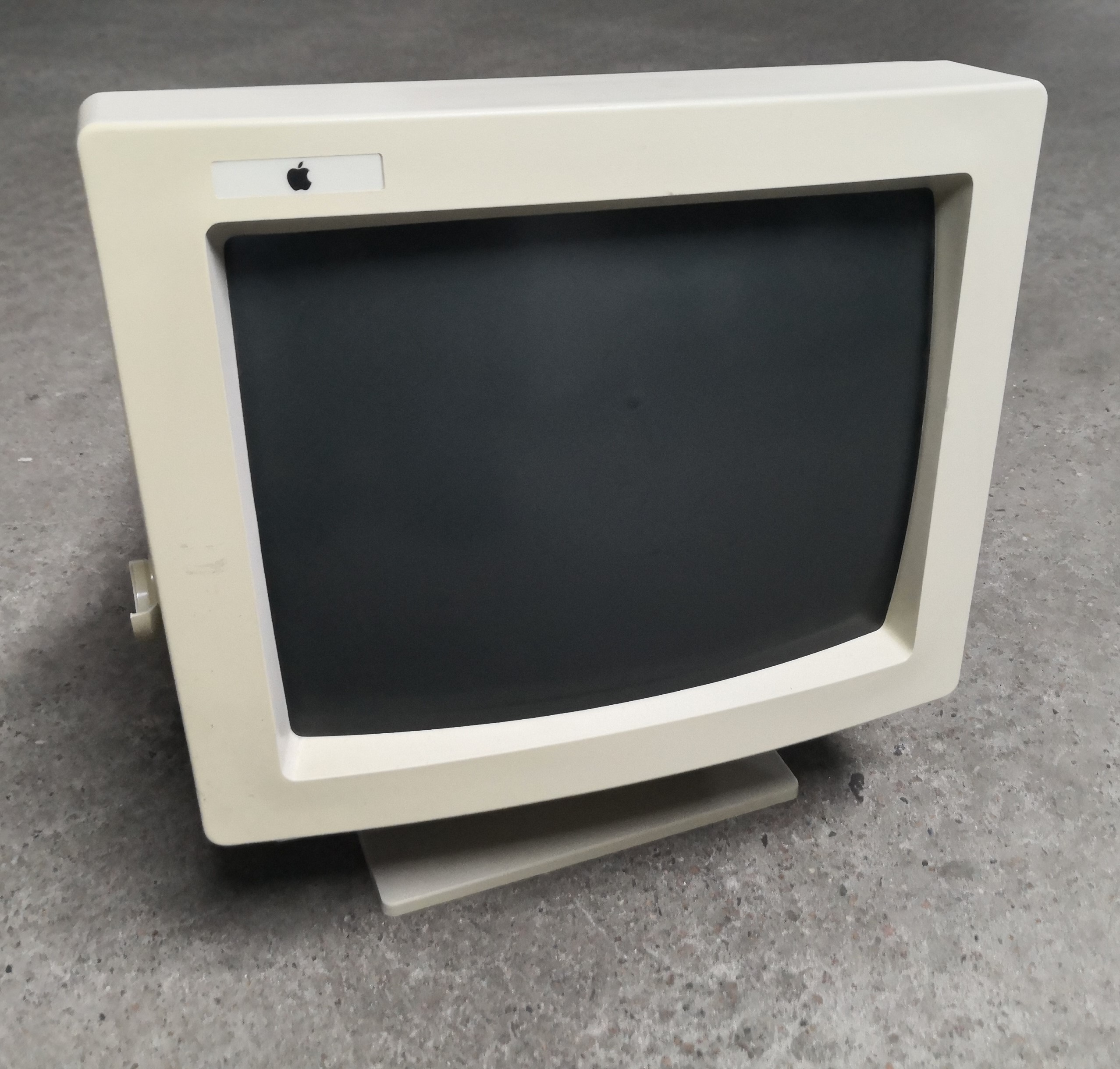
At the front you’ll spot the proof of absolute zero passion. The Apple logo somewhat slapped into the space which the OEM left there: 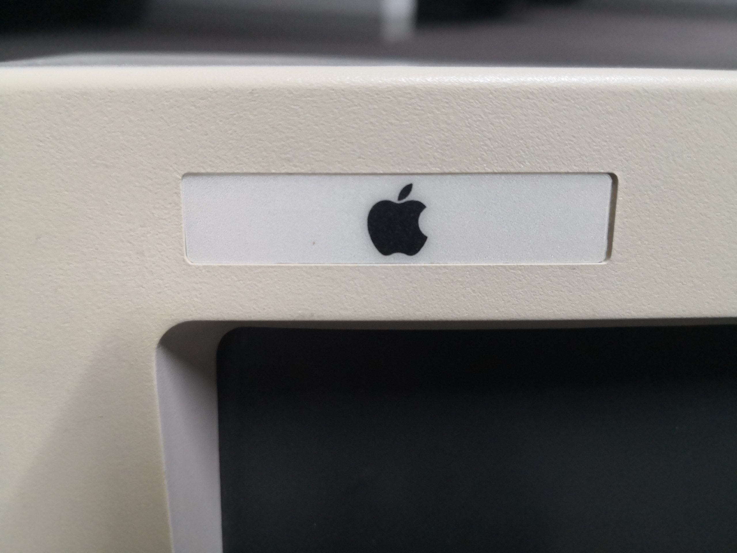
Yes, it’s a bog-standard, VGA monitor, lowly specs and ugly as hell.
The photos don’t do it justice – it’s even uglier in real-life.
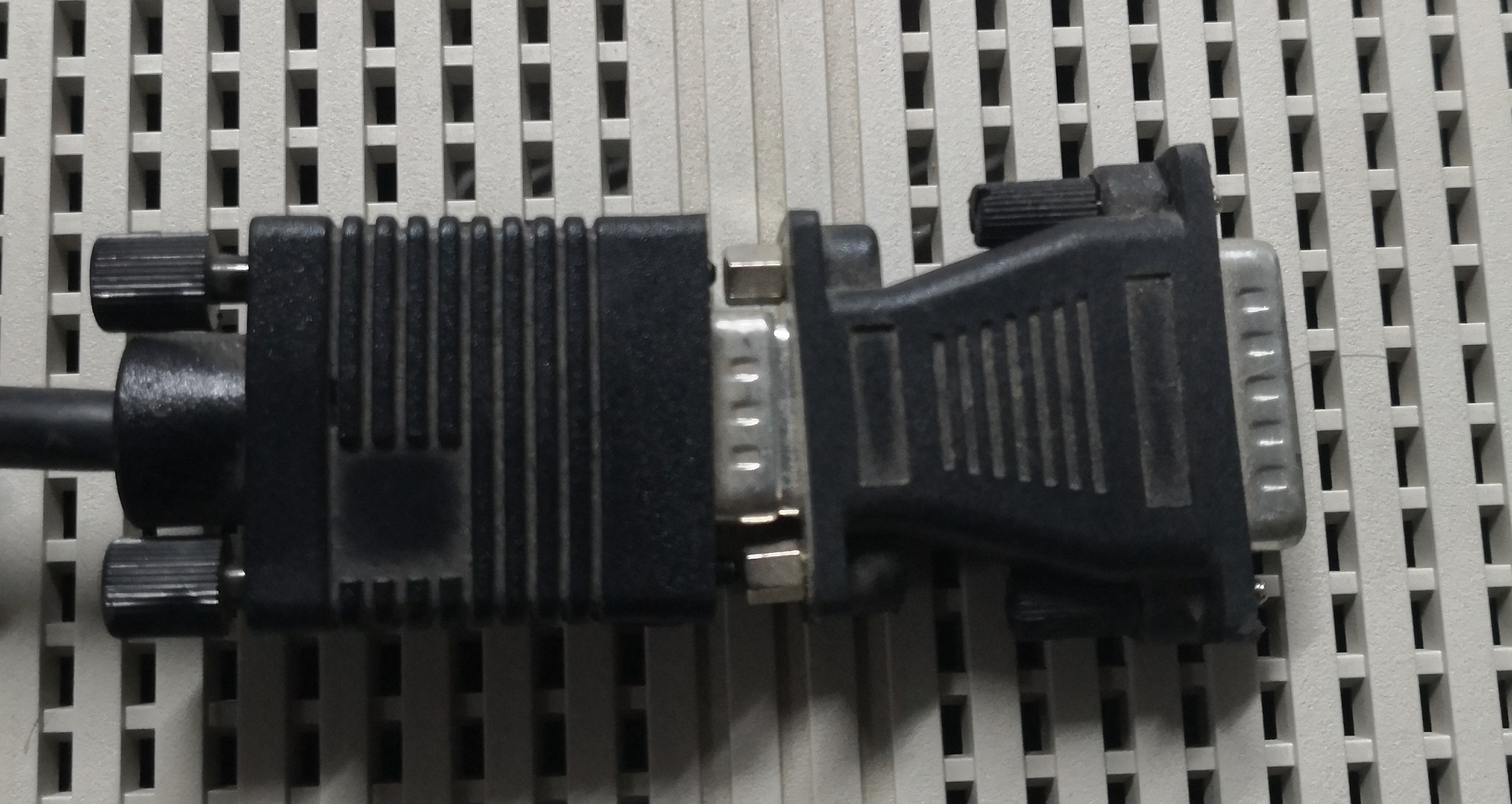
They even did not change the cable to the (back then) Apple 15-pin standard video port but just stuck an adapter to it:
No wonder it was so short-lived (February 10 to October 21, 1993)
Just to show that Apple was definitely to do better. The first monitors sat more or less flush on the computer cases. Even those with a swivel-base showed the typical design language, an embossed/color Apple logo etc.


