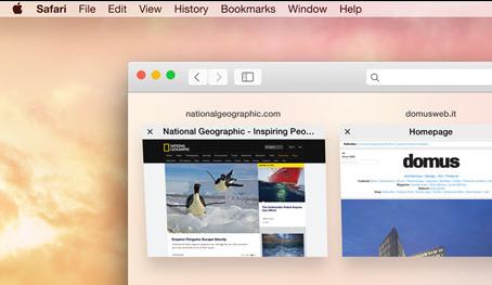
Ok, so we all had a close look at if there was a “one more thing” at WDCC. Well, not for me – but that’s a personal view.
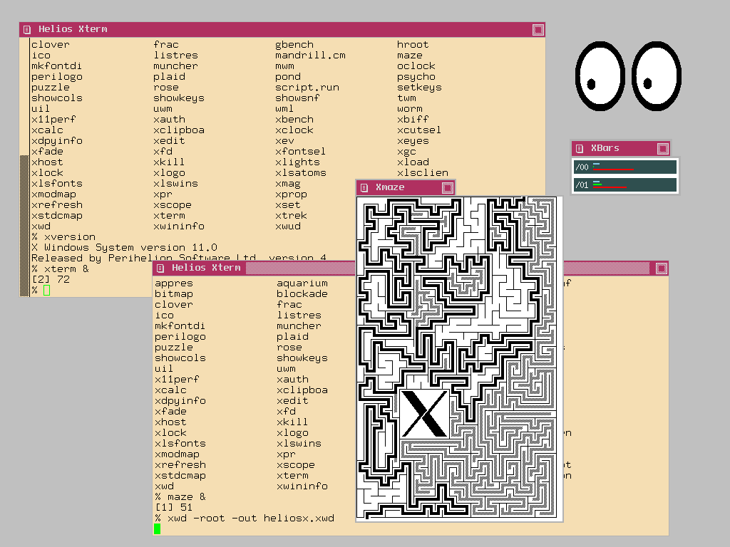
Looking through my Yester-Tech pair of glasses, one thing caught my eye (pun intended ;)): OS X UI design is getting flatter (and flatter). It just struck me this time as I was just thinking how to get a more modern window manager running on Helios’ X11, which offers twm and mwm for now, looking like this:
Doh. That looks flat. And simple. But it just does its job: Manage windows (move, pop-over/under etc.). But from the beginning of UIs, everybody was looking left and right what Apple, SGI or even Microsoft did design-wise. And they were all trying hard to get a more 3D’ish look, mostly by using embossing and beveling.
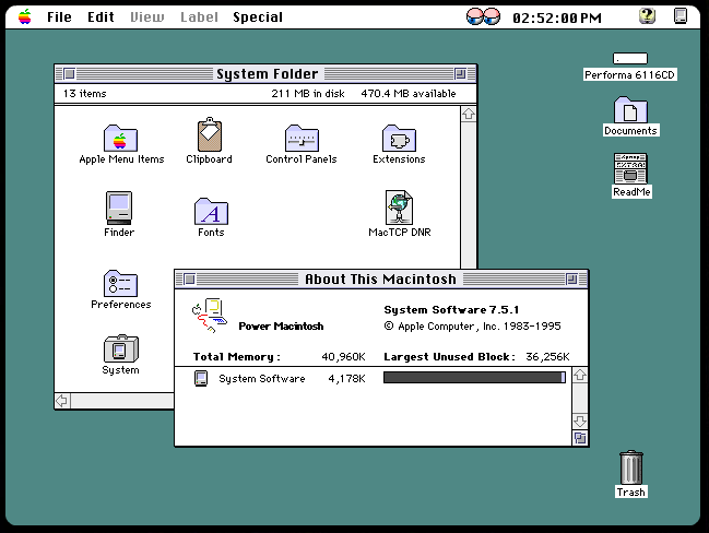
So, at a time MacOS 7.x looked like this
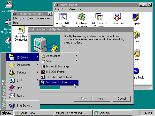
Windows 95 tried to catch up (W98/NT/2k looked pretty much the same)
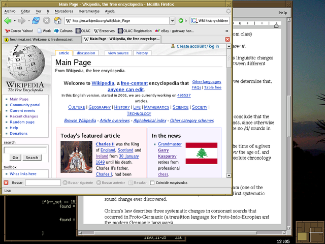
and the free fvwm was the free alternative to $$$ Motiv on X-Window:
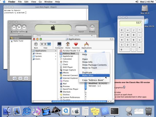
Then came Mac OS X with its Aqua-look and all of the sudden spherical buttons, rounded corners and lolli-pop colors became a must-have. The original:
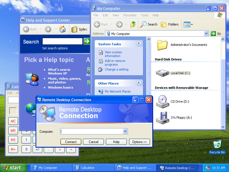
And the look-alikes from MS (Windows XP):
…and yet another X window manager (KDE this time):

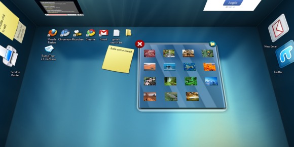
After that hell broke loose and all sorts of crazy, mostly Hollywood inspired and supported by the capabilities of all those l33t 3D video-cards, 3D user interfaces hit the street web. Bumptop was one of many:
Then, slowly people recognized that while a UI might look cool, it might also be unusable or gives you a headache when using it for real work. So things cooled down and the clock went backwards.
With Windows 8 (and Windows Mobile following) UIs started to get flat again. And rectangular. Besides the “Windows 8 Modern UI” (aka Metro), even standard desktop windows and dialogs got pretty flat

And last but not least with iOS 7 and soon-to-be-released MacOS X 10.10 Apples UIs also will get flatter…
Am I the only one who feels “been there, done that”? Is flat the new 3D after it’s been very flat before?

